
Platform documentation to get the most out of your solution.
Solutions on the Intellifold platform combine Data Analytics, Data Visualisation, Process Mining, and AI techniques to enable users to effectively and efficiently analyse their business process based on event data from source systems. Solutions are developed based on a process use case with the aim to:
(1) reduce process inefficiencies such as process deviations, bottlenecks, and rework activities.
(2) enhance compliance with insight into control failures, unexpected paths or missing steps, risk-based insight to support risk management and audit functions.
(3) assess where to effectively apply automation (RPA, low-code, AI) and measure the impact of automation initiatives.
(4) support system transformations (upgrades, redesign, M&A) by showing in detail how current system use matches the new (standard/intended) system functionality.
Login to the platform with the unique user credentials provided. Please note that Multi Factor Authentication (MFA) is available in our production server for extra security.
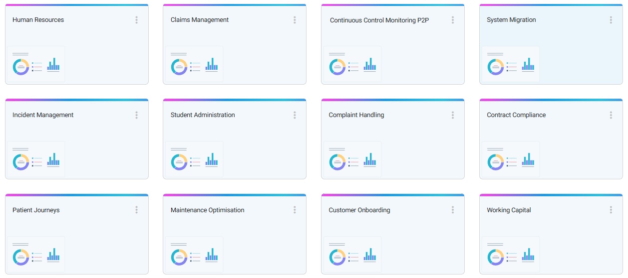
After login select the relevant Project environment and Solution. Please note different solutions might be available for your organisation. Every Solution typically relates to one use case or one business process. Data from multiple sources might have been integrated into the solution.
Intellifold Solutions follow common application UX/UI standards which should make most navigation intuitive. However, there is unique functionality, and this might require a bit of playtime to get yourself familiar. In general, a 'left' click relates to selections and actions, while the a 'right' click is used for additional information and settings.
The automatically generated process flow is the core of Process Mining. It leverages the time stamps from the transactions, event, and change logs in the source systems to extract the relevant activities/events and associated links. The flow is completely interactive, and a great source to perform process-based investigation and analyses.
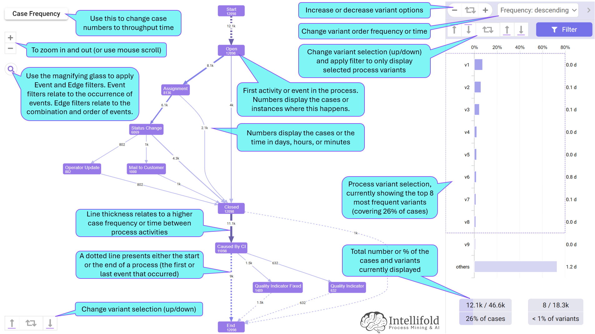
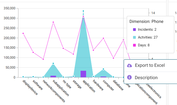
The dashboards provide similar graphs and visuals to most data visualisation products. There are categories or dimensions such as supplier or product and facts or measures like numbers, values, and throughput times. Clicking in a graph gives options for further filtering.

The Filters in the Intellifold platform are super powerful. These can be set anywhere and apply everywhere. Filters can be applied to dimensions in the data such as company, equipment, order type etc. or can relate to process flows and KPIs. Applied filters show up at the top of the solution screen and can also be changed directly there.
There are different types of filters that can be used in solutions:
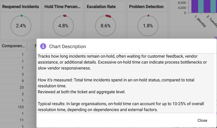
Right clicking anywhere on charts or filters provides the options to get additional information or to export the results to Excel.
Descriptions for chart are maintained in the design. Solution design provides full flexibility in what dimensions and measures to use, how to display and in what size and colour, and what descriptions will be madde available to end-users of the solution.